A black, white, and grey living room offers timeless sophistication without the fussiness of busy color schemes. These neutral tones create a clean canvas that works with nearly any design style, from minimalist to eclectic. Unlike trendy color palettes that feel dated after a season, monochromatic schemes ground a space while letting texture, lighting, and furniture speak for themselves. Whether you’re starting from scratch or refreshing an existing living room, these three neutral shades provide the flexibility to experiment with patterns, materials, and accessories. The key is understanding how to balance them so your space feels curated, not cold or bland.
Table of Contents
ToggleKey Takeaways
- A black, white, and grey living room delivers timeless sophistication by using a 60-30-10 ratio: 60% white for dominance, 30% grey for mid-tones, and 10% black as defining punctuation.
- Texture and contrast prevent neutral spaces from feeling flat—layer materials like smooth leather with chunky knits, matte paint with glossy finishes, and natural wood with metal to maintain visual interest.
- Lighting is critical in monochromatic schemes; use layered lighting (ambient, task, and accent), dimmers, and strategically placed sconces to transform the space from flat to dimensional.
- Black, white, and grey works across all design styles, from minimalist to eclectic, because neutrality lets furniture, patterns, materials, and carefully chosen accessories do the talking.
- Artwork and metallics (gold, silver, copper) serve as your main accessory tools to refine the palette and showcase personality without disrupting your color scheme.
- Invest in quality furniture like a grey sectional as your hero piece, and observe paint colors at different times of day to ensure warm or cool tones match your room’s natural light.
Why Black, White, And Grey Works For Every Living Room Style
Black, white, and grey form the backbone of sophisticated interior design because they’re inherently versatile. Black adds drama and definition without overwhelming a room. White opens up space and reflects light, making even smaller living rooms feel airy. Grey sits comfortably between them, it’s the diplomatic neutral that softens black’s intensity while grounding white’s potential coldness.
This trio works across design aesthetics. In a modern minimalist space, they keep things clean and focused. In a traditional living room, they provide a refined backdrop for classic furniture. Even eclectic or bohemian interiors benefit from a monochromatic base that lets statement pieces shine. The neutrality means you’re not fighting against the walls or major furniture pieces, you’re building on them.
Practically speaking, these colors hide wear better than lighter shades alone. A grey sofa shows less dust than pure white, while black accents ground the space without showing every scuff. When you’re investing in quality furniture and decor, a neutral palette ensures your choices stay relevant for years, not just seasons.
Color Balance: Creating Harmony With Your Monochromatic Palette
Balance is everything when working with only three colors. The common mistake is treating them equally, say, 33% each, which flattens the space. Instead, aim for roughly 60% white, 30% grey, and 10% black as your starting point. White becomes your dominant color, usually walls and larger furniture pieces. Grey fills the mid-tones through accent walls, larger upholstered items, or architectural features. Black serves as punctuation, think trim, hardware, art pieces, or statement furniture.
This ratio isn’t a hard rule: adjust based on your room’s natural light. North-facing rooms with limited sunlight benefit from more white to bounce available light around. South-facing rooms with abundant natural light can handle deeper greys and blacks without feeling cramped. Luxury living room designs often use this principle to create sophistication, they anchor neutral spaces with black elements like frames, fixtures, or upholstered pieces that add visual weight.
Consider how each color appears at different times of day. Warm-toned greys shift slightly under incandescent bulbs, while cool greys can feel sterile under fluorescent light. Grab paint samples and observe them in your actual space before committing. The sheen matters too, matte finishes feel cozy, while eggshell or satin sheens add subtle sophistication and are easier to clean.
Furniture And Layout Ideas For Black, White, And Grey Spaces
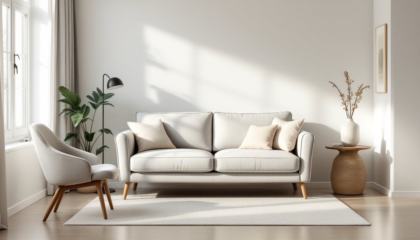
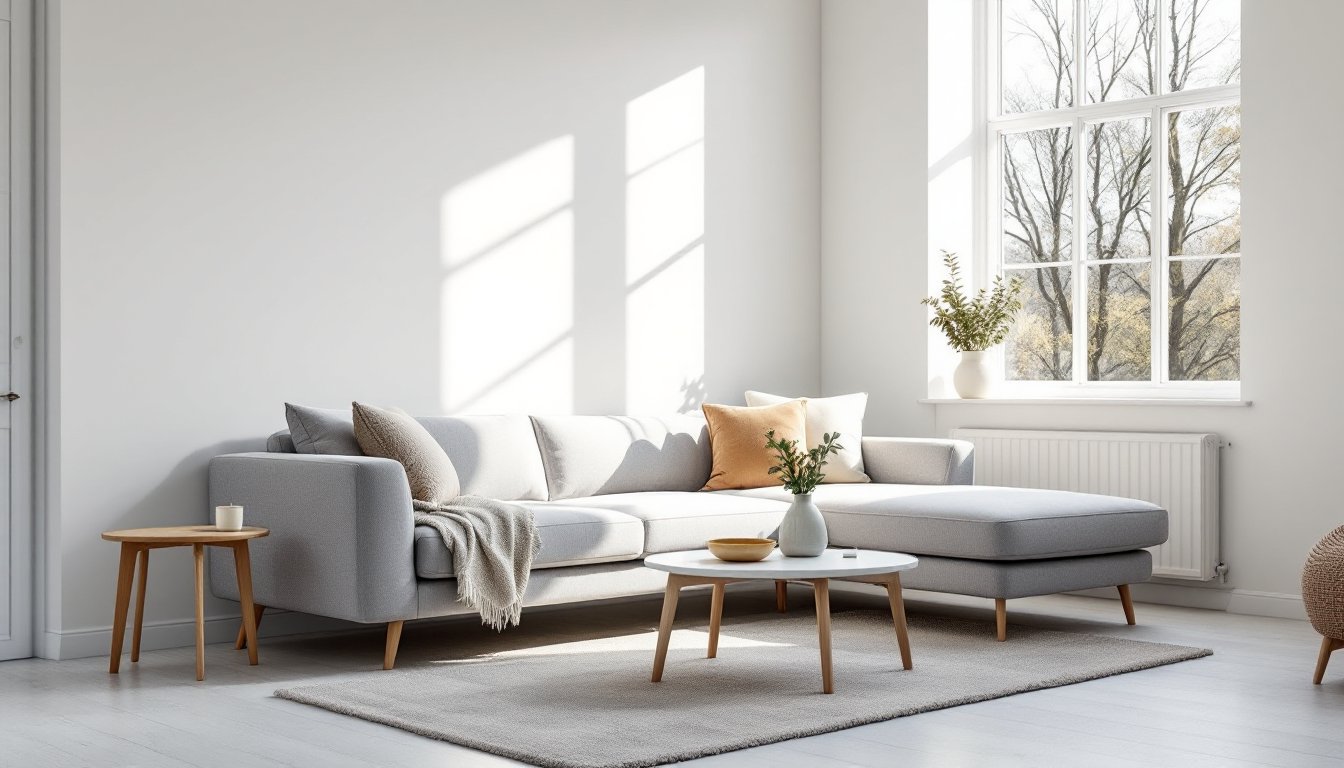
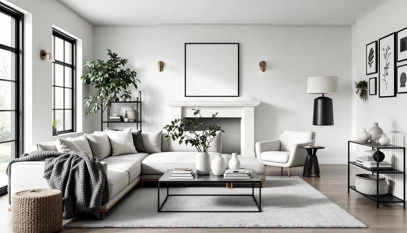
Furniture selection anchors your neutral palette. A grey sectional or sofa becomes the room’s hero piece, it defines the seating area without shouting for attention. Pair it with a white or light grey accent chair to add visual interest without introducing new colors. Black furniture works best sparingly: a side table, media console, or accent chair. A completely black sofa can overwhelm unless your room has bold architectural features or substantial natural light.
Layout principles stay the same in neutral rooms, but the impact shifts. Without color to define zones, rely on furniture arrangement and scale. Create clear pathways, anchor seating with a coffee table, and ensure sight lines aren’t blocked. Model home living rooms demonstrate this principle well, they use varied furniture heights and materials to maintain visual interest without relying on color diversity.
Mix furniture styles thoughtfully. Modern clean-lined pieces work alongside traditional wingback chairs in this palette because the monochromatic scheme ties everything together. Storage pieces like bookshelves or media consoles keep the space functional without adding visual chaos. Choose upholstery textures in your neutrals, a knit grey ottoman differs visually from a smooth grey sectional, creating dimension without color change.
Adding Texture And Contrast To Prevent A Flat Look
This is where amateur neutral rooms fail: they skip texture and end up feeling sterile. Your living room needs tactile variety to feel inviting. Start with your largest surfaces. Instead of flat painted drywall, consider a textured wallpaper, shiplap accent wall, or subtle wall treatment in grey. These add depth without introducing color.
Layering textures prevents monotony. A chunky knit throw on your sofa contrasts with smooth leather on a chair. A sleek glass coffee table pairs with a rough-hewn wooden side table. A soft area rug grounds the seating area, a high-pile grey rug feels entirely different from a flat-weave natural fiber option. Woven baskets, linen curtains, and upholstered ottomans each add their own texture story.
Materials create contrast too. Matte paint next to glossy finishes, natural wood against metal, linen beside velvet, these combinations keep the eye moving. A black metal bookshelf against white walls creates contrast through material difference, not color. Interior design inspiration showcases how successful neutral rooms layer materials deliberately. Don’t spread texture evenly: cluster similar textures in zones so the eye reads intentional groupings rather than random busyness.
Lighting Solutions That Enhance Your Neutral Living Room
Lighting transforms a black, white, and grey space from flat to dimensional. Neutral colors are naturally light-reflective, which means your lighting choices become even more critical. Layer your lighting: ambient (overhead), task (reading lights), and accent (highlighting artwork or architectural features).
For ambient lighting, recessed fixtures or a simple chandelier in brushed nickel or black works well. Avoid ornate brass fixtures that introduce a competing finish. Table lamps with grey or white linen shades add warmth without color. A black sculptural lamp serves as both functional lighting and décor in a neutral room, it’s expected in this palette, where it becomes part of the design rather than a decoration.
Accent lighting highlights your neutral space’s best features. Picture lights above artwork, wall sconces flanking a fireplace, or directional track lighting pointing toward architectural details, these create visual hierarchy. Dimmers are essential: they let you adjust ambiance from bright and energetic to warm and relaxed. In a monochromatic space, lighting changes the entire mood more dramatically than it would in a colorful room. String Edison bulbs or candles add organic warmth without introducing color, especially valuable in modern or transitional living rooms.
Accessorizing Without Breaking Your Color Scheme
Accessories in a neutral room function differently than in a colorful space. They’re not meant to inject color (though metallics like gold, silver, and copper add richness). Instead, they refine the palette and showcase your personality.
Artwork is your biggest accessory tool. Black and white photography, abstract art with grey tones, or minimalist prints all strengthen your palette. Living room wall art doesn’t require color to make an impact, form, composition, and contrast matter more. A living room gallery wall in black frames with mixed prints (photos, line drawings, textured pieces) adds visual interest without breaking your scheme.
Small accessories, pillows, throws, books, decorative objects, should honor your palette or stay neutral. A black ceramic vase, grey woven basket, or white sculptural piece each add intentional detail. Metallic accents (brushed gold, silver, or copper hardware, picture frames, mirrors) elevate the space without disrupting the scheme. Plants bring organic texture and subtle color variation that feels natural. Keep accessories curated: a few meaningful pieces beat a cluttered collection of unrelated objects. Design inspiration from curated homes shows how restraint in a neutral room creates sophistication. Books with black or grey spines stacked on a coffee table become part of your design story.
Conclusion
A black, white, and grey living room transcends trends because it’s built on design fundamentals: balance, texture, contrast, and purposeful lighting. These three neutrals give you complete freedom to express your style through materials, shapes, and carefully chosen accessories rather than relying on color. Whether you prefer minimalist calm or layered richness, this palette adapts to your vision. Start by committing to your ratio, then build depth through texture and lighting. The result: a sophisticated, inviting space that feels curated, timeless, and unmistakably yours.